Thursday 17 April 2014

Not so Messy Monochrome

Hello and welcome.

I have been in somewhat of a creative slump lately and not spent much time in my craft room, but I have been enjoying the delights of YouTube and the hours of amazing videos of other people's creativity. Just entering "mixed media" in the search box has turned up loads of inspiration and some interesting artists.

One in particular is Jennibellie and I have decided to join her Journal Workshop ning site. One of the groups on the site is the Monthly Challenge and the challenge for this month is to create a messy monochrome art journal spread with the use of a maximum of two highlight colours.

OK - so as my post title suggests, I didn't score too highly on the messy part of the challenge - but this is where the inspiration took me, and after such a dry spell, I went with it...


The background is Dylusions Black Marble, and, although you can barely see it there are also random stampings of various Kaiser Craft texture stamps in Jet Black StazOn. Additional texture was added by flicking water splashes on the Dylusions and then picking up the colour with kitchen towel.


The trees are white and green acrylic paint and applied thorough the Crafter's Workshop  TCW171 Tree of Life template. The green tree was outlined with charcoal pencil and over painted with Cosmic Shimmer Meadow Lush mist to give a hint of shimmer.


I'm making a real effort to do some stash busting this year so I've used letter stickers from my stash for the page title. The white letters are American Craft Remarks "Sarah Script" and the green letters are Making Memories green Puffy Alphas. I coloured over the Puffy Alphas with Promarkers to try and match the green to the tree a little better (It changed colour from a yellow green when I applied the shimmer mist).


Finishing touches were to outline the white letters with a fine black pen, outline the green letters with white ink, apply watered down white acrylic splashes over the whole page (masking the green tree first), draw a line and dots border around the page with a Posca paint pen and finally add three die cut felt bird embellishments.

It isn't a messy monochrome but I'm really pleased to have felt creative again!

Thanks for looking.

Wednesday 16 April 2014

WOYWW #254

Good grief is that the time! The Minor Moonshines are on school holidays at the moment and I must confess it is all very chilled out here at Moonshine Manor - so much so that I had no idea it was a quarter to two - must go and make some lunch!

Before I do that though, here is a quick look at what is on my workdesk this gorgeous, sunny and warm Wednesday - to be honest there is more activity on the washing line today, but since I have actually managed to produce something creative this week I thought I would share it with you. (Why? go here to find out).


I've been playing in my art journal, and this is my page for a challenge over at Jennibellie's new  Journal Workshop Ning site.

Short and sweet today - just as our hostess likes it, hope the weather is lovely where you are.

Monday 31 March 2014

Tim Holtz 12 Tags of 2014 - March


Uh Oh - scraping in under the wire with this one methinks!

This month Tim has demonstrated two different stamping techniques on his tag, the first being "smudge" stamping (where you deliberately smudge your still wet inked image to give a blurred vintage effect) and the second, using the smudge technique on second generation stamping (re-using your stamp after making the initial impression without re-inking your stamp, to give a softer less intense image - great for backgrounds).

You can see Tim's original Tag here.

Once again I was sans stash for this project but when I saw the freebie stamps that came with this month's Creative Stamping magazine, I couldn't 1.) resist and 2.) NOT use them for this project!

So here is my take on Tim's March Tag...


You see what I mean about the freebie stamps?


I haven't added any dimensional embellishments to my second generation tag as I plan to use it in a journal spread and want to keep it flat on the page.


My smudging didn't work particularly well, you can see it best on the tiny butterfly just above the reef knot.

The next two shots are just to illustrate the difference between first impression and second generation stamped images.


Tim's stamp set has a plain egg shape for the background and a second speckled stamp for the detail - mine didn't, but my index and little finger ends were the perfect size and shape!

Sorry I couldn't take any more shots, my camera batteries ran out :0(

Well that's it from me, off to post my link - I think I've still got time...

March Calendar Girl

Hello and welcome.

Apologies for my long absence - I've been busy sewing for a Spring craft fair so I haven't been doing much paper crafting lately.

I have managed to complete a couple of projects, so here is the first of two very quick posts, the first being my March Calendar Girl...


March 20th was the first day of spring here in the UK and I wanted to reflect this with my colour palette, so I chose yellow and green to represent the daffodils and primroses coming in to flower in my garden.

I'm still on my quest to do a bit of stash busting this year and have used a Dovecraft chip board frame, some of  my miles and miles of ribbon, a couple of random blooms and a wood veneer bird. The stamps are from Studio G.

Better start thinking about my April Girl ... hmmm

Wednesday 5 March 2014

WOYWW #248

Hello and welcome, fellow workdesk wanderers.

We are, as ever, hosted by the amazing Ms Dunnit over at The Stamping Ground - do go there to find out how to play along.

I'm in a bit of a creative slump at the moment, so although there is a lot of stuff on my desk there isn't really much action, but here it is anyway...


I'm working on my March Calendar Girl - a Spring themed tag - not going brilliantly at the moment - but I shall persevere. Hope your desk is more inspiring than mine - let me know you came and I'll pop over later.

Friday 21 February 2014

Craft Barn Q & L Challenge - Strong


Ooops - I'm sneaking in a bit late with this one!

Time for another challenge at The Craft Barn and this time I have chosen the word STRONG for my quote book.

I am trying to find quotes which are meaningful to me in some way or another, and this one spoke volumes...

"Even strong women need an arm to lean on now and again" J D Robb

I've gone right out of my comfort zone with this layout. As you probably know, I don't rate myself as any kind of an artist, so to put a face I've drawn on my project is a bit of a biggie for me.  I've been studying YouTube tutorials hard and I was inspired to paint this Whimsy Girl, and she seemed to fit the quote, so here she is...


Backgrounds are brought to you by Dylusions ink sprays in Bubblegum Pink, After Midnight and Vibrant Turquoise.


And Whimsy Girl II is brought to you by Caran D'ache Neocolor IIs and a few details added with Midnight Blue Cosmic Shimmer Mist.


I hope you like her.

Wednesday 19 February 2014

WOYWW #246


Hello and welcome fellow desk hoppers! (Not a desk hopper yet? Go here to join in the fun).

It is half term here at Moonshine Manor and I have the house to myself today as Moonshine Minor is visiting Grandma and Grandad and Mr M has driven Moonshine Major to Swansea for an Applicants Day at the University. Needless to say, I am making the most of the lack of demands on my time to have a good old play in my craftroom.

I bought some mache monograms in 2011 (I know this because the receipt was still in the bag) with the intention of altering them and putting them at the top of one of the walls in my craftroom. I had never quite worked out how I was going to hang them up so I had put them away in the wardrobe of despair and forgotten about them. Some time last week it occurred to me that if I cleared all the knick-knackery off my window sill I could stand them on there as a cool, arty, mini installation. So, to get to the point of what WOYWW is all about, what is on my workdesk today is - my altered monogram project...


Oh, by the way in case you are interested, the February Calendar Girl I had on my desk last time is now finished, you can see her here if you like.

That's it from me, what's going on in your craft space today

Tuesday 18 February 2014

Tim Holtz 12 Tags of 2014 - February


Hello and welcome.

Time for another link up to Mr Holtz's blog and to reveal my take on Tim's February tag. You can see the original tag and tutorial here.

Tim has gone for a chalkboard look, and as I missed trying this technique on his November tag I was keen to give it a go (with mixed results... I'll explain at the end of the post)

I've pretty much stuck to Tim's original design, just changing some of the details to work around any missing supplies. So without further ado - here is my February Tag...


As you can see I didn't have Tim's hearts layering stencil so I made do with a TCW Harlequin design.


I used a Paper Artsy stamp HPXT04 which had a suitably loved up, but appropriately sized, sentiment, and a flourish  from October Afternoon's Remember When calendar set which was still out on my desk from making my Calender Girl tag. The heart is cut from greyboard using a Cuttlebug die and covered with Dimensional Magic and ordinary micro glitter.


The key and metal trim have been touched up with a little TH Antique Bronze DS to blend with the colour palette.

As I said above, I had mixed results with Tim's chalkboard technique - possibly because I was using a different embossing powder (mine was whatever I had in my stash rather than Tim's Antiquities Frosted Crystal). I never seemed to catch the embossing powder at that magical point between turning from matte to gloss and so was really unhappy with the results I got (see picture below).


In the end I decided to use a Versamark stamp pad and talcum powder to create my chalkboard effect. So now I'm happier with the look and my tag smells scrummy too!

Thanks for stopping by, let me know you came, I'd love to see your take on Tim's tag.

Sunday 16 February 2014

February Calendar Girl


Hello and welcome friends!

I may have been away from blogland for a little while but I have been doing some crafting!

Mostly I have been altering tags, here is my February Calendar Girl tag, and I will post my February Tim Tag later in the week.


It being February it was inevitable that my Calendar Girl would have a Valentine's Day theme, but I decided to steer away from the traditional red and pink colour palette and go for black and white with some pops of red.

If you follow my blog you are probably aware that my crafting resolution for 2014 is to use up some of my stash rather than just collecting it. I've always tended not to use things, thinking that I should save them for a "special" project, but I'm making a real effort to get past that mental block and use my goodies if they work on a particular project .

The background is a white cardstock tag  (I used the Julie Nutting doll stamp packaging as a template) covered with Echo Park Yours Truly Love Notes paper which I stamped with a Craft Stamper (CS) freebie grungy heart stamp. I then randomly rubbed white acrylic paint over the tag with my finger to push the design right into the background. The edge is inked with Black Soot DI, but this reacted with the white acrylic to create a greyish smudge so I used another CS freebie, grungy border stamp and Jet Black Archival to stamp a random border. I used a black Sharpie to soften the squared off edge of the stamp.

The doll was stamped onto Neenah white cardstock and coloured with Copic markers. I made the mistake of stamping the image with Jet Black Archival ink, and even though I dried it thoroughly the stamped image has bled slightly where the Copics have touched it. Note to self - buy a black Memento ink pad!


Her dress is paper pieced from a Papermania 6x6 paper stack. I chose papers with the same design but with the colours reversed to emphasis the frill on her skirt. I used a coat of matte medium to seal her dress and then added shading with a black Pitt Big Brush pen. Some tiny red gems completed her outfit.


The gem swirl was made using a Bazzills InStitch'z template and some black Papermania Gems.


The heart border at the bottom is some decorative tape which I bought on-line thinking it was washi tape - It is actually a fairly glossy adhesive tape but it looks OK here. The LOVE bingo card is a Kaisercraft Miss Match stamp, stamped on white cardstock. The gorgeous red velvet rose is a Making Memories Vintage Hip Finding (a mega bargain from TKMaxx - I got 4 sets of these (two roses and three vintage style buttons) for about £3!) The black acetate flourish and heart are K&Co Elegance Die Cuts. I am using October Afternoon's Remember When calendar stamps for all my Calendar Girls, as each month is written in a different font, which I thought would add a bit of interest to the tags. February is stamped on a Memory Box Bistro Label die cut which has black inked edges.  You can see from the supplies I've used that some of this stuff has been in my stash for years - at last it is getting an airing!

Thank you for taking the time to visit - happy crafting!

Wednesday 5 February 2014

WOYWW #244


Hello again and thank you for dropping in. You're probably here because you know all about the phenomenon that is What's On Your Workdesk Wednesday... but if not, and you want to play along, go to Julia's place for all the details.

So here we are with a new month - which for me means new blog challenges to be completed. I've been over and looked at Tim Holtz's 12 Tags of 2014 for February - hmmm - bit of an issue with lack of supplies - so I'm still puzzling over what I'm going to do with that one. I'm hoping to start playing along with Kate Crane's Calendar Journal challenge over at The Kathryn Wheel, and of course I have my own personal Calendar Girl Tag challenge on the go too.

OK, so I've gone for the easy option, and I'm playing dressing up dolls again! Here is my desk with my February Calendar Girl in progress...


A different view again this week, taken from the back of the desk from the window end. You can see my bucket of Copics and my box of Promarkers - all stored nib down - SHOCK HORROR!

You can also see a stack of cheap exercise (composition) books in the foreground - I'm using one of these to make notes for my Calendar Girls - so that if I have a brilliant idea for, say, October I can jot it down and not have forgotten all about it when the time comes.

The cardboard tube is the inside of a cling film roll, and is really sturdy - so I'm adding it to my collection of random tubes-which-may-or-may-not-be-re-purposed-into-some-amazing-gorgeousness-one-day, and the empty multi-vitamins pot will go in my box of things-to-make-painty-marks-with.

Aside from that, everything else is either stuff that is still there from last week or being used in the current project...


This is my progress so far - I have deliberately avoided a red & pink colour palette, even though I am going with a Valentine's Day / love  theme. I'm using black and white with a hint of red, and again I'm making an effort to use up some of my stash.

You may be wondering why I have a legless girl - not a comment on too many Valentine's Day glasses of Champers! - I had a mishap with my shading on her dress and inadvertently coloured her knees a rather unpleasant shade of grey - so I've had to re-stamp and colour her legs and will have to surgically re-attach them later!

Well, that's what's happening here today - what have you got going on? Let me know you came and I'll catch up with you soon.

Thursday 30 January 2014

Sssh - Pray Silence for The Craft Barn's Q&L Challenge


Hello and welcome fellow crafters!

Time for another entry into The Craft Barn's Quotes and Lyrics challenge. (Click on the link to get all the details). This time the prompt words are silence and dazzle.

You may be aware that I'm putting together an AJ style quote book with blank spaces on my pages so that I can collect more quotes as I go along. For this challenge I have chosen the word SILENCE and a beautiful and thought provoking quote by Ruth Fishel,

"I will take time to be alone today. 
I will take time to be quiet. 
In this silence I will listen... 
and I will hear my answers"


It is VERY unusual for me to use my own handwriting on ANY layout, but for some reason today I don't seem to hate it quite as much as usual, so it is making a VERY rare appearance!


This layout has been a bit of a love/hate project. I hated the background when I first painted it. It is two colours of blue acrylic over a VERY loud and busy floral tissue paper. The paints seemed to be really grungy and produce a miserable January-esque sky colour - topical, but NOT what I wanted!

A quick spritz with some London Blue Dylusions lifted things immediately and I could see that the layout had potential. Additional background layers came from an Indigo Blu circle dot background stamp, randomly stamped in black Archival and some texture paste layered through a dotty mask. I had hoped that the texture paste dots would remain white for some contrast, but as it dried it soaked up the colour from the underneath layers - oh well... A few splats of White Linen Dylusions completed the first "go" at the background.


The die cut clouds were inked with Faded Jeans DI and adhered to the page using  Scotch quick drying glue. I didn't use matte medium as the Dylusions are water reactive and would have "run". When the clouds were dry I went round the edges of them with a Faber Castell Big Brush marker and smudged the line to blend. This really anchored the clouds on the page. The title is made from Papermania Mini Alpha stickers (keeping up with my stash busting resolution!).

Next I die cut the birds - I was originally going to keep them white, but ended up colouring them black, and stuck them to the page - this time with a smear of matte medium on the back but not on the front.  They are birds but I think this layout has a bit of a look of a Battle of Britain skyscape about it - the tiniest birds could easily be confused with Spitfires!

Finally I went in with my Paper Artsy ink splatter stamp and randomly stamped with black Archival, making sure to get some splashes on the clouds to ground them on the layout. I used a Craft Stamper freebie grungy border stamp to partially frame the page.


Close up showing: grungy border stamp, ink splats, 
FC Big Brush blending and Faded Jeans DI inking

All in all I'm pretty pleased with this layout, especially as I really wasn't keen on it at first! Please do let me know you came - I'd love to see what you are up to.


Wednesday 29 January 2014

WOYWW #243


Hello again and welcome to another What's On Your Workdesk Wednesday - the last one in January! - Can you believe how quickly time is flying by?

If you're visiting from The Stamping Ground you know all about what's going on here today, and if not - you need to head on over there and find out - YOU'RE MISSING OUT!

My workdesk is a little bit tidier than last weeks (and for those of you who visited - YES! - I did tidy up the wardrobe too (but the difference between the before and after photos is so minimal I haven't bothered to upload the after one - I think I need some reasonably priced Swedish shelving to sort the problem out once and for all!))

So here's my desk - mid project again! My Mojo is in full swing :0)


What can we see?

I've taken the photo from the back corner of my desk for a change of perspective. In the foreground you can see a pile of 12x12 patterned papers from which I have selected the most boring, plain, mid blue sheet I possess - it must have been in a stack - otherwise I can't work out what "possessed" me to buy it!

To the right of that is a little pile of goodies - an Amy Tangerine 6x6 paper stack, some Kaisercraft cardstock embellies and a gorgeous little Tim Holtz stamp (an early Easter present - along with some TH Distress PAINTS! from my lovely Mum and Dad - THANK YOU!)

Working round to the right are the freebie stamps and diary from this month's Creativity magazine which I got for £3.50 at a local craft shop (I wasn't prepared to pay the cover price (I didn't really want the diary) and hope that Creativity aren't putting up the price on a permanent basis.) In the middle of the table is a storage box which houses all my mini pigment ink pads.

On the cutting mat is my WIP (work in progress), which is my entry for The Craft Barn's latest challenge (details here if you're interested), and on the left is my trusty Cuttlebug - I am in the middle of cutting out clouds.

So that's what's happening in Maisie's world - what's happening in yours? Let me know you came and I'll swing by and visit.

Thursday 23 January 2014

January Calendar Girls


Hello crafting friends and thank you for visiting.

I recently did an " In the spotlight" interview over at Our Creative Corner (OCC) (it's here if you want to read it), one of the questions was, "If you have lost your Mojo, how do you go about getting it back?"  Well, to be honest my Mojo went AWOL at Christmas and I've been in a bit of a crafting doldrums ever since. So, true to my interview response I've been looking around for sources of inspiration - and sometimes you get inspiration when you least expect it! - I recently picked up a copy of Creative Stamping magazine (mainly because I was drawn to the knife, fork and spoon freebie stamps - sad - but true!) A quick flick through the mag left me a bit disappointed - but then I'm not really a card maker - until I came across an article from the DT at Ali-Craft showcasing the Prima doll stamps - and then... Ding! - a light bulb moment and my personal 2014 challenge was born.

I am setting myself a "calendar girls" challenge - no silly, not the naked WI with strategic cakes style Calendar Girls, but a monthly themed tag featuring the Prima doll stamps  (or stamp singular - in my case!) I have also made the resolution to make a mega effort to use up some of my stash, so the current challenge over at OCC is perfect to get my newly returned Mojo back in working order!

The challenge is "No more shopping sins" (click on the link for details) and is an opportunity to use up some of the stash that's gathering dust in forgotten boxes and to confess your stash shopping sins and make a clean start in 2014.

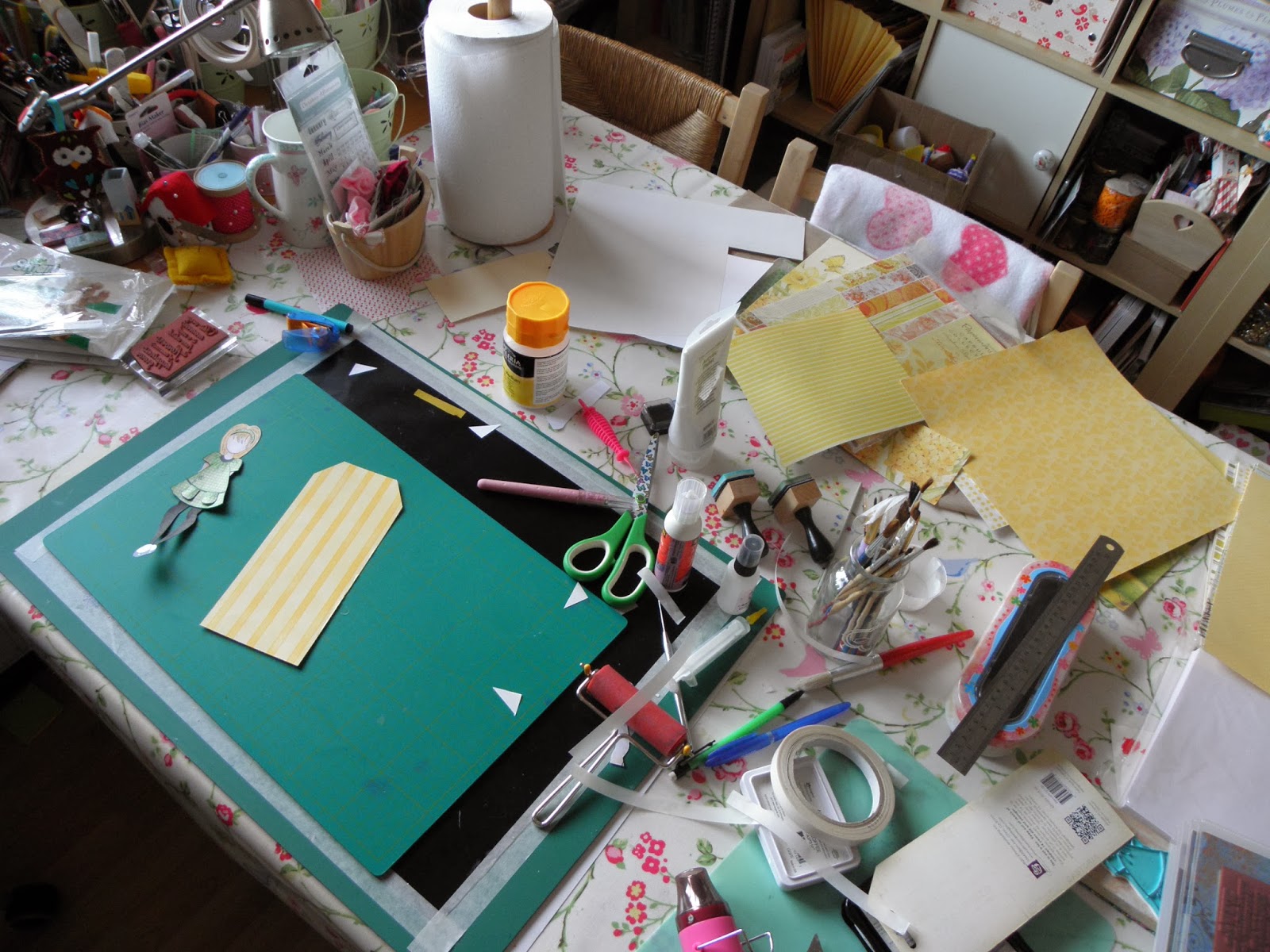
So here is my January Calendar Girls tag...


I chose cold colours and a snowy theme to reflect the chilly weather we can have here in the UK in January.


It was fun pulling together various different stamps to make my cluster of embellishments - and of course I have unearthed some I'd forgotten I'd got!

So - to confess my stash shopping sins - I am a terrible sucker for a "bargain" - if it is vastly reduced in a sale bin and I think I may have a use for it at some point it will - almost inevitably - end up in my shopping basket!

Case in point with this tag - the self adhesive fabric ribbon and co-ordinating brad were in a sale of Dovecraft Christmas lines three or four years ago and have not been out of the packet until today.

Talking of ribbon - I just LOVE printed grosgrain ribbon - can't resist a pretty ribbon - OMG I'm SUCH a girl!

The Papermania ticket stamps were reduced to £2 in my local craft shop, the clock stamp was a freebie on a Creativity Magazine - can't resist a "freebie"!


The snowflake rub-ons (part of a set of glitter snowmen) were in a BOGOF (Buy One Get One Free) offer at The Works, again three or four years ago.

I must also confess that the Cuttlebug Swiss dots embossing folder had its maiden voyage in the making of this tag - and I've had that for donkey's!


Then there's the patterned paper - you know how that calls to you from the racks in the craft shop... so I'm pleased to be able to say that I have CUT INTO FOUR - that's FOUR, people, - different pieces of patterned paper from FOUR different stacks in the making of this project! (I needed a lie down with a cold compress afterwards mind you!)

Those of you who know your way around Julie Nutting's doll stamps for Prima will know that this is NOT one of Julie's designs. I had great fun (which really took me back to my childhood!) designing and making suitably warm attire for my January Girl.


I started by stamping the doll stamp (Doll No.2) on to white Neenah cardstock, loosely cut out my image and coloured in the face and neck with Copic markers.


I then stamped the image again on to copier paper and drew my "warm clothes" design over the top of the original image. 


I cut the pattern pieces out and used them as a template for making the finished clothes from patterned paper.

The new clothes were then glued over the top of the original stamped image and details such as creases and buttons were added with a fine black Pitt artists pen. A coat of matte medium made the surface of the finished doll non-porous and allowed me to add shading with Pitt Big Brush india ink markers.
                                                                                                                                                                

The final touch was to add a generous coat of Dimensional Magic (Glossy Accents equivalent) to the spotty wellies to give them a lovely "bang on trend" shine. Oh yes and those are supposed to be fluffy earmuffs - in case you were wondering :0)

So there you have it - my sins confessed and my project completed - and a head full of inspiration for February's tag too...

Wow - that was a long post - thanks for sticking with me - let me know you came and I'll try and catch up with you soon.

Hugs
Related Posts Plugin for WordPress, Blogger...