
Hello friends!
I had so many lovely comments about the faux batik tag I posted on Wednesday that I thought you might be interested in a quick tutorial. This post is photo heavy but I think it helps make sense of the technique.
I learned this technique at the monthly Art Journaling class I attend at Crafty Bunch in Telford so I must thank our lovely and super talented teacher Kaz Hall for kindly allowing me to share the technique with you. You may have seen some of Kaz's work in recent issues of Craft Stamper, if not pop over to her blog The Little Shabby Shed and check out her amazing work, she's a really lovely lady and always happy to welcome new visitors.
On with the show then...
Firstly a reminder of the sample tag I posted on Wednesday...

There are two things to keep in mind as you look at the tag, firstly the cardstock is manila cardstock (I'll come back to this later) and secondly the photographs have been taken directly under a halogen bulb so you are seeing a very exaggerated sheen on the piece.

For the tutorial I am going to show you the same technique, but instead of on a tag it will be a background for a journal spread and will be on white cardstock,
The idea behind this technique is to create a design which resists the coloured ink you are applying to make your background, leaving the design in the substrate (cardstock) colour rather than as a black or coloured stamped image.
You will need:
Embossing Ink (such as Versamark)
Clear embossing powder
Heat tool
Scrap or brown paper (not greaseproof)
Your chosen substrate, eg cardstock, tag, journal - a light colour will work best
Stamps and or stencils
Dylusions spray inks
A kitchen roll
Iron
Heatproof surface (eg craft mat)
Step 1.
Ink your chosen stamp with heat embossing ink and stamp the image on to your cardstock. (You can also press the Versamark through a stencil. (Make sure you clean your stamps and stencils carefully afterwards as embossing ink is very sticky))

Step 2.
Pour clear embossing powder over your inked images. If you are doing a large project (mine is a double A4 spread) you may need to repeat steps 1 and 2 rather than do it all in one go so that your ink doesn't dry before you get your embossing powder on. I completed my stamped images in one step and then the stencilled images in another.
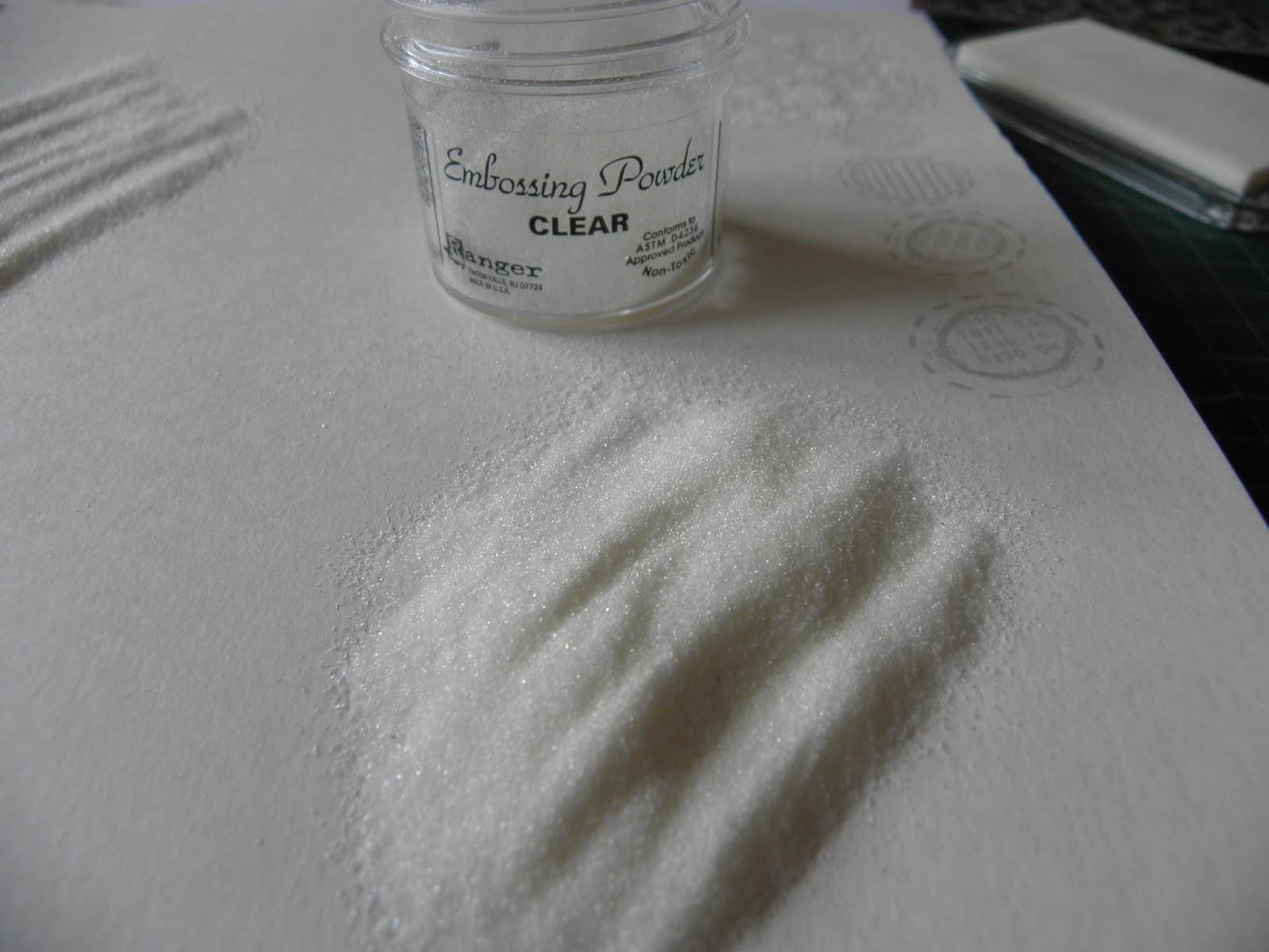
Shake off the excess on to a piece of scrap paper and return to the pot.
Don't worry if you have some specks of embossing powder floating around it all adds to the effect
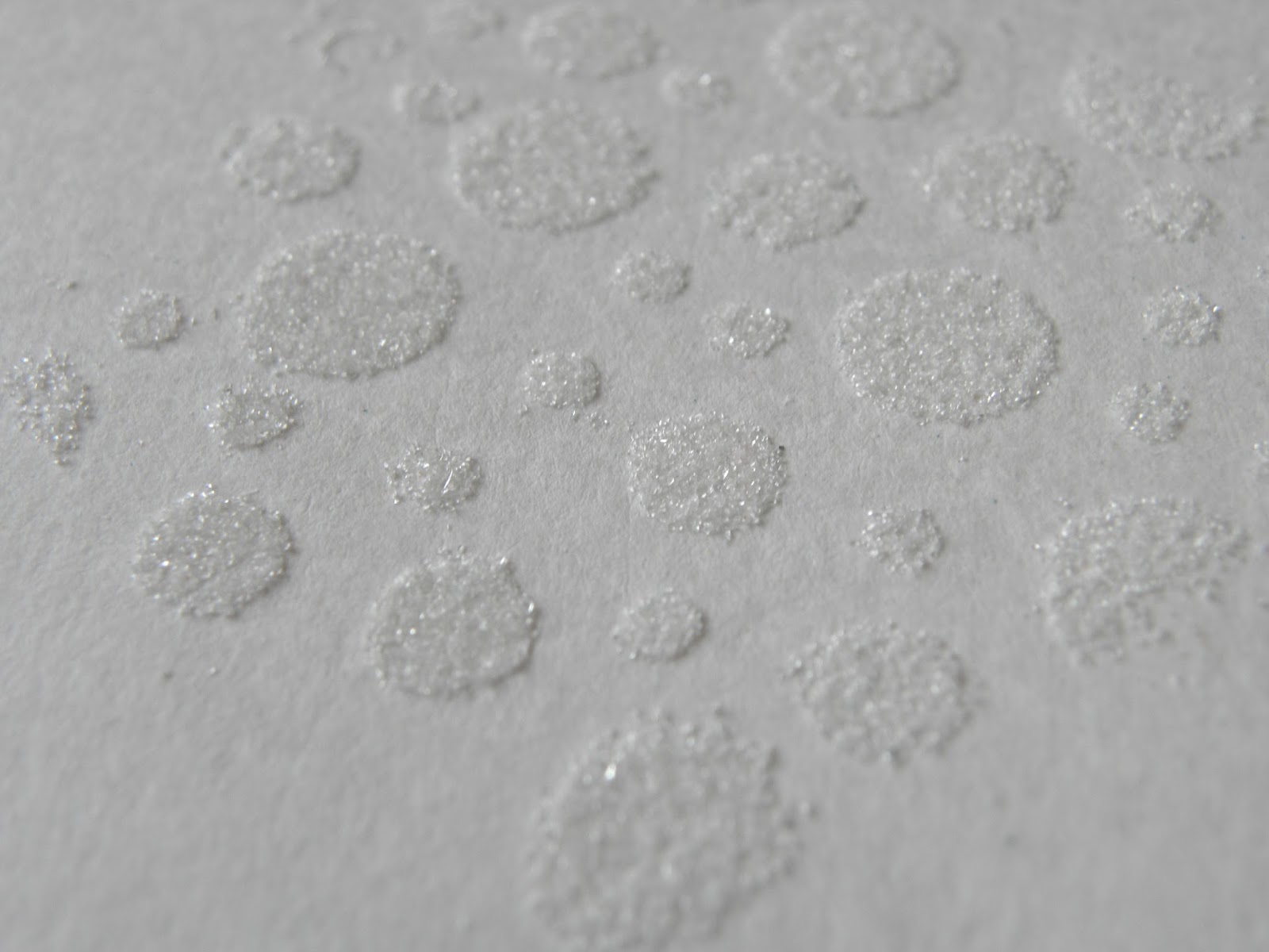
Step 3.
Melt the embossing powder with a heat tool - enjoy the magic!

Step 4.
Working quite quickly, spray your inks randomly over your cardstock, you will get great blends where the colours overlap. You can also spritz with water to get the trademark Dylusions reaction look. Be careful not to over ink or you will get a very muddy colour.

Roll a full kitchen roll over the wet ink to take off the pooled ink before adding more colour in the spaces if necessary (this helps stop the muddiness). Repeat this again when you have finished inking to remove all excess ink.

You can see where the heat embossed images have resisted the ink.

Step 5.
Place scrap or brown paper over the cardstock (if using brown paper place it shiny side UP) and then iron over it with a reasonably hot DRY iron (DO NOT STEAM)

Eventually you will see "greasy" looking areas appear on the scrap paper, this is the embossing powder melting and being lifted off.


If, when you come to lift your scrap paper off, you find that it has become stuck, simply re-iron until it comes free.
Your finished faux batik piece will show your stamped/stencilled design in the colour of the substrate on a coloured background.

You can then go on to decorate this further. In the tag above I have over stamped the same foliage stamp in black archival ink to make it pop and I've added some gold metallic dots around the leaves.
The technique followed was exactly the same for both samples but you will notice the two very different effects given by the colour of the substrate, the tag (manila) has given a lovely golden glow to the batik effect, whilst the journal spread (white) is quite a stark contrast.
The sheen on the tag has come from sections of the embossing which haven't quite lifted off when ironed. You could experiment with different iron temperatures to see which effect you prefer.
I do hope you will have a play at this technique, all of my classmates really enjoyed trying it and we had some great - and surprising results.
I'm off to work on this page some more. Thank you for looking. Enjoy!

P.S. You can see how this page is coming on here
P.P.S. You can find Part 2 of the tutorial here


Isn't this a great technique! You've illustrated it beautifully. Hugs, Jenny x
ReplyDeleteBrilliant tutorial, thanks
ReplyDeleteRosie x
What a fabulous technique! Thanks for sharing it!
ReplyDeleteOoo loving all you photos, your results look fabulous!! See you soon
ReplyDeleteKaz x